Building a strong and recognisable global brand

Brand consistency doesn’t happen by accident. It requires clear guides, approvals, and ownership. This page is your starting point. It defines the core elements of our visual identity. While it doesn’t cover every creative possibility, it gives you the structure you need to stay on brand, while still thinking outside the box.
 
When in doubt, contact your marketing team!

A new era for bematrix

 
beMatrix vs. bematrix

bematrix: standing for more than a matrix inspired building system. In the early days, bematrix set out to challenge the event-building industry with a revolutionary modular ‘matrix’ system made in Belgium. That mission succeeded. Today, the world knows the 62 mm grid system inside out, and bematrix stands for so much more than frames alone.

We’ve grown into a global brand and innovative leader. That’s why we’ve evolved our name: from emphasising matrix to confidently standing as bematrix.

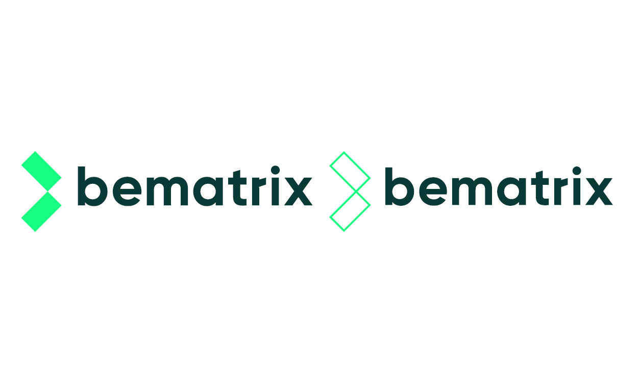
Recognisable, everywhere, at all times.

Logos

This is our primary logo. We prefer to use the logo where bematrix is fully written on one line, so it is easy to read. Our logo has no baseline.

Next to our primary logo, in the brand book, you'll find:

  • Secondary logo
  • Framie
  • Rental network logos
  • beMaster network logos
  • bePartner network logos
logos-3
Letter by letter, we lead.

Fonts

Gilroy is our go-to font, and for good reason: it’s clean, straightforward, and highly legible, making it perfect for both short headlines and longer reads. Gilroy brings even more to the table. Numbers play a big role in our communication (hello, 62!), and Gilroy’s numerals are crisp and balanced.

While Gilroy is our steady companion, Supercharge is added to our selection. It’s bold, dynamic and full of attitude. Perfect for accentuating headlines, powering up key messages or making statements that need to stand out. We use Supercharge sparingly but intentionally, to inject that extra punch.

fonts-2
Our box of crayons to bring some colour.

Colours

   Midnight madness    E.T. phone home

   CMYK: 92 - 47 - 55 - 53

   RGB: 5 - 58 -55

   Hex: #053a37

   PMS: 5467 C

   CMYK: 73 - 4 - 65 - 0

   RGB: 23 - 252 - 130

   Hex: #17fc82

   PMS: 7479C


   Milk mustache    Pastel portal

   CMYK: 0 - 0 - 0 - 0

   RGB: 255 – 255 - 255

   Hex: #FFFFFF

   PMS: Opaque White

   CMYK: 31 - 38 - 0 - 0

   RGB: 196 - 173 - 232

   Hex: #c4ade8

   PMS: 2072C
colours

Access to the brand book

Our brand is more than just the logos, fonts, and colours mentioned above. In the brand book, managed by the marketing team, you can find clear guidelines for every possible asset to ensure consistency across all touchpoints.


A peek inside the brand book

A full overview of our...

  • product architecture
  • merchandise
  • clothing
  • demo material
  • packaging


Guidelines for our...

  • design elements (e.g. 62 grid and Framie pattern)
  • printed materials (e.g. business cards, blocnotes, brochures, postcards...)
  • digital materials (e.g. email signatures, website designs...)
  • labels and icons
  • signage
  • videos
  • animations
  • bematrix showrooms
  • bematrix stands

To request access, simply submit an email to marketing@bematrix.com and we're happy to send you the brand book!

Stay updated, your way

Whether you’re into deep dives or prefer just the key highlights, you’re in control.
No inbox overload - just the content that matters to you!